Choose a personality
When starting a new project, you should decide on what personality you want it to have. Check out these examples from Tailwind CSS:


A financial services company might want to aim for an elegant personality, whereas an educational game for kids would probably prefer a playful one.
There is a lot to say about how to convey a given personality, most of which is beyond the scope of this page. Here, I just want to give you the 80/20 version.
Spectrum
It is helpful to think of personalities as falling along a spectrum of how "serious" they are.

You can control how "serious" your app feels by tweaking the following three variables:
- Roundedness
- Font
- Color
Roundedness
Various UI components have corners. Buttons, cards, inputs, badges, etc.
- If those corners are very rounded, the app will feel playful.
- If those corners are square, or perhaps only slightly rounded, the app will feel serious.
With RFUI, various components will accept a rounded property. The possible values will be "square", "sm", "lg", and sometimes "full". Check out Button as an example.
I'd recommend choosing a value and sticking with it throughout your app. For demo:
- If you are going for a serious personality, choose
"square"or"sm". - If you are going for a playful personality, choose
"lg"or"full". - If you are going for a more neutral personality, choose
"sm"or"lg".
To choose a roundedness value for your app, in short, you'll want to set the --default-roundedness CSS variable. See the "Default roundedness" page for more information.
Font
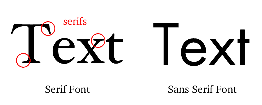
For fonts, there are two broad categories: serifs and sans serifs.

As you can see in the image above, serifs have those "little thingies" on the letters, whereas sans serifs do not.
- Serif fonts convey a serious personality.
- Sans serifs convey a more straightforward, neutral personality.
- Sans serifs that are particularly rounded and "bubble-y" convey a playful, light personality.
For font recommendations, check out Butterick’s Practical Typography.
In fact, check out "Summary of key rules" from Butterick's Practical Typography as well and make sure that you follow them.
RFUI was designed with the Open Sans font. All of the examples you see in the docs use this font. To use this font, refer to their docs.
Color
In general, certain colors have certain "vibes".
- Blue is known to be pretty neutral.
- Pink is a good example of a color that is playful and fun.
- Brown feels serious.
- Gold feels elegant.
So in choosing your color palette, you'll probably want to choose a primary color based on the "vibe" you want your app to have.
--color-primary-50, --color-primary-100, etc. See the "CSS variables" page for more information.But wait! You're not a professional designer. Or maybe you are, but you're more focused on UX and haven't really trained in visual design or color theory. So how do you create a whole color palette?
You don't. Doing so takes skill, training, and experience. Instead, you can cheat by finding a color palette online that has been designed by a professional.
- Color Hunt is a pretty good resource.
- You can pay someone to design a custom color palette for you.
- You can also just use the colors that RFUI comes with. I got them from the book Refactoring UI.